Understanding the traffic heatmap
Read the heatmap to find peak hours, slow periods, and staffing opportunities.
The traffic heatmap shows when your store is busiest during the selected period. It gives a visual view of traffic patterns by day and time, making it easier to identify peak hours, slow periods, and recurring trends.
What the heatmap shows
Use it to understand:
When traffic is highest and lowest
Which days are busiest
Which time periods may need more staff
How customer visits change throughout the week
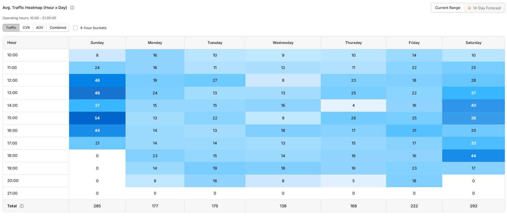
How to use the heatmap
Check, for example:
If weekends are busier than weekdays
If mornings, afternoons, or evenings perform better
If traffic increases after a campaign or promotion
If certain hours consistently have low traffic
This helps with staffing, planning, and store performance analysis.
Using filters with the heatmap
The heatmap updates based on the selected dashboard filters. Before reviewing, make sure you have selected the correct date range, store or location, and metric (if available).
Info: The heatmap reflects the selected data. If the chosen date range has little or no traffic, the heatmap appears empty or lighter than expected.
If the heatmap is empty
Before contacting support, confirm that:
The correct store and date range are selected
The store was open and visitors entered during the selected dates
Store opening hours are configured correctly in Store Management
The device serial number is assigned to the correct store
Related articles
Need help?
If the heatmap is empty or does not look correct after checking store, date range, opening hours, and traffic data, contact Avia support at avia.support@retailogists.com and include:
Store name
Selected date range
A screenshot of the heatmap
Whether traffic data appears in the dashboard
What looks incorrect or missing